The brief
Batch is a marketplace where consumers book experiences for bachelorette parties, birthdays, group trips, and more. As the business matured, Batch introduced a vendor fee — a meaningful shift in the partner relationship. Partners were now paying to be on the platform, and they deserved to understand what they were getting in return.
The goal
Replace partner faith with evidence. Build an analytics experience that makes Batch's marketing value tangible and gives partners insight they can act on, not just a wall of numbers.
Deliverables
- — Listing Performance analytics page
- — Predictive Demand Data page
- — Partner onboarding into the new analytics experience
- — Benchmarking and contextual insight system
Timeline
2024 (1 month)
Role
Lead Product Designer — design and strategy, partnered with PM and engineering. 400+ partners.
Background
Beyond bookings, Batch was already driving real marketing value for its partners — impressions, photo views, video engagement, saves, itinerary adds. None of it was visible. Partners had no dashboard, no data, and no way to see the top-of-funnel activity their listing was generating.
The fee made Batch's value tangible, but without visibility partners had to take it on faith. This project was about replacing that faith with evidence.
The problem
The opportunity wasn't simply about satisfying one user group — it was about designing something that served three distinct stakeholders at once.
- Partners (primary): no visibility into how their listing was performing. Without impressions, engagement, or conversion data, they couldn't tell whether the fee was worth it or what to do to grow.
- Account managers (secondary): the ops team lacked a shared language with partners. Conversations about listing health were vague and reactive rather than proactive and strategic.
- The business (tertiary): Batch needed to demonstrate its value as a marketing platform — not just a transaction layer — in order to retain partners and justify the new fee structure.
Approach
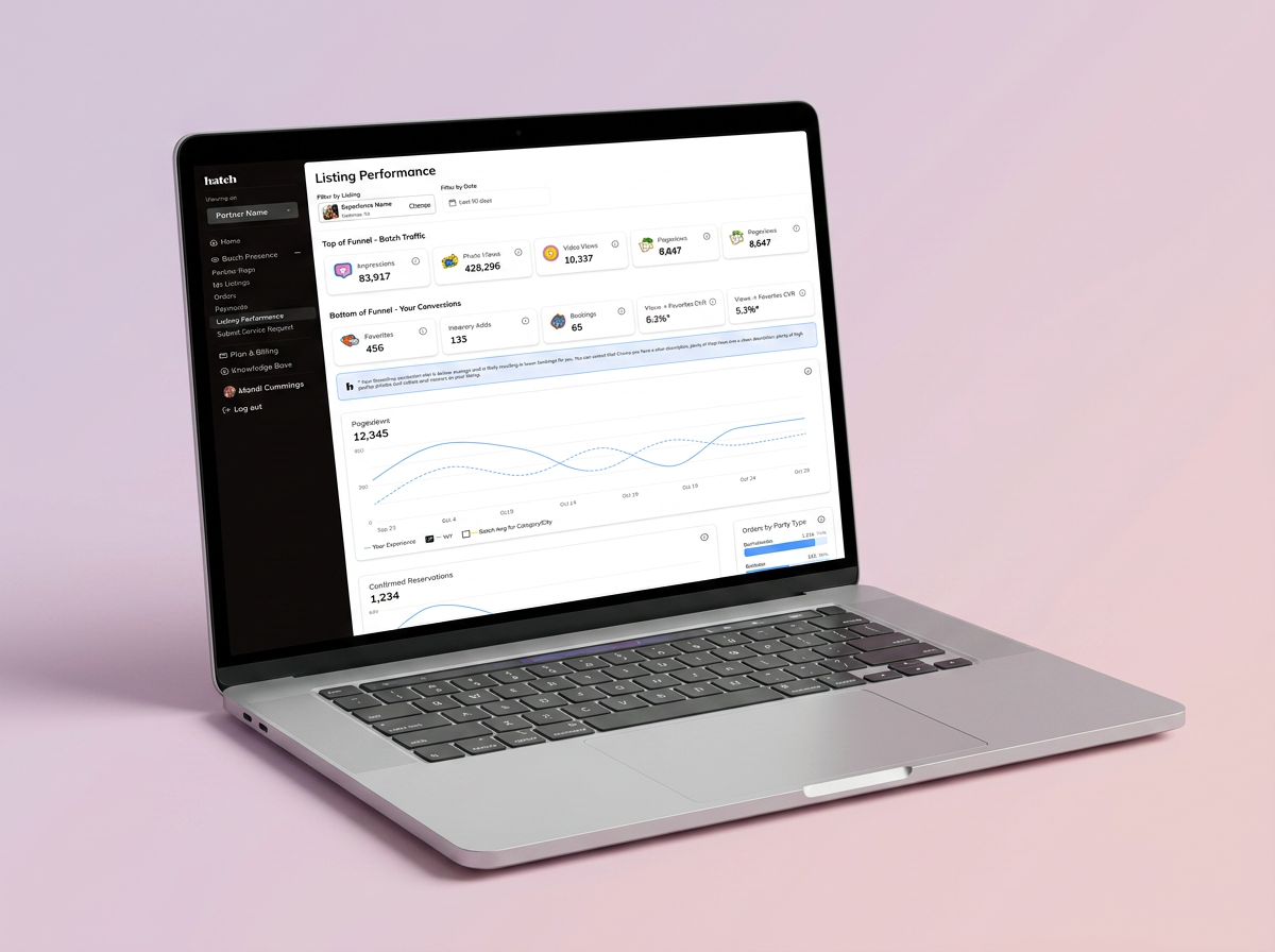
Analytics dashboards have a well-known failure mode: they show a list of numbers and leave the user wondering what to do with them. The central design challenge was avoiding exactly that. A partner seeing their conversion rate for the first time needed to understand not just the number, but whether it was good, what was driving it, and what they could change.
That principle shaped every structural decision on the page.
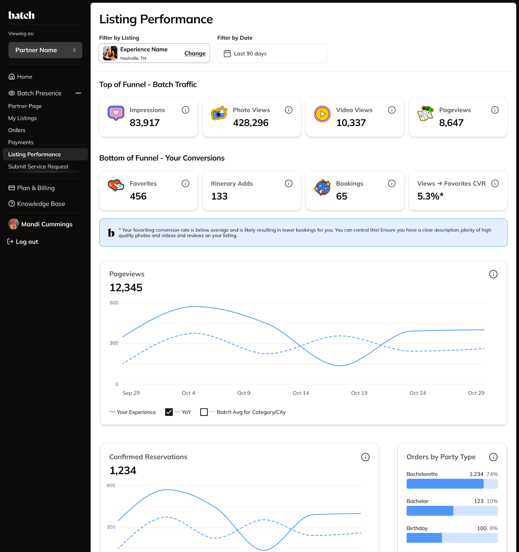
- Functional hierarchy — metrics were organized into 'Top of Funnel — Batch Traffic' and 'Bottom of Funnel — Your Conversions.' The framing gave partners an immediate mental model: Batch brings the audience; the listing converts them.
- Benchmarking context — every metric was anchored against a 'Your Avg vs. Category Avg' comparison. A number in isolation is not actionable; a number relative to peers tells a partner exactly where they stand.
- Conversion guidance — when a metric fell below average, such as a low Views-to-Favorites rate, a contextual prompt explained what was driving the result and what to do about it. Insight and recommendation lived in the same place.
- Information architecture — listing performance and city demand data started as a single view. Separating them into two purpose-built pages clarified the experience: one is about the health of your listing; the other is about the health of your market.
The solution
A full analytics view for each listing. Funnel metrics at a glance, time-series charts with category benchmarks, orders by party type, conversion rate, ratings, and marketplace ranking. Contextual insights surface dynamically based on a partner's actual data, triggered by real performance signals rather than generic advice.
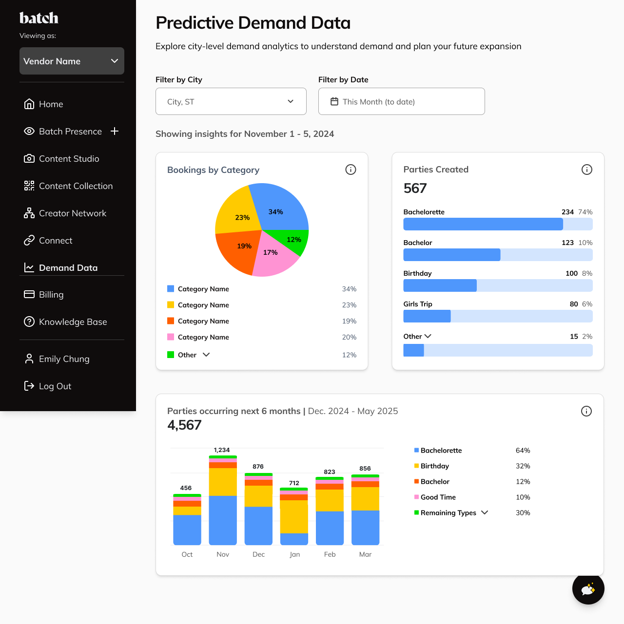
Predictive Demand Data
This page carried a different kind of weight. It wasn't about a partner's own listing — it was about showing them something no other platform could: real, proprietary demand signal from Batch's own high-intent audience.
Batch's audience isn't casual browsers. They are people actively planning a party right now, in a specific city, with intent to book. The Demand Data page was designed to make that audience tangible to partners — not through demographic projections or national trends, but through actual party planning activity happening on Batch, broken down by type, volume, and six-month forward momentum.
That framing shaped the design decisions: surfacing upcoming party volume by category and city, highlighting which party types were surging in the months ahead, and presenting the data in a way that felt less like a report and more like competitive intelligence. The implicit message to every partner was clear — the demand exists, it is in your city, and Batch is the most direct path to it.
Challenges: When the data isn't there yet
One of the more common challenges with data-driven products is deciding what to show when there's nothing to show yet. That came up in a few meaningful ways on this project.
A new partner has no listing history. No pageviews, no bookings, no conversion data to measure. And if they're operating in a city that Batch recently expanded into, the demand data for that market is still developing. Both situations are expected parts of how the platform grows, but without intentional design they make the page feel incomplete or broken.
After exploring a few internal directions, I ruled out hiding charts until they had enough data to populate, and I didn't want to lean on vague "coming soon" language that made it feel like a product gap. The approach I landed on was transparency: each data set got its own empty state that clearly explained why there was nothing to display yet, specific to that partner's situation rather than a generic fallback message.
For partners in newer markets, I added a persistent notice at the top of the city demand page letting them know they were viewing an emerging city and that the data would grow as Batch's presence there did. The intent was for partners to feel informed about where they stood rather than confused about why the page looked the way it did.
Results
The signals after launch were qualitative but meaningful — and in many ways more telling than a single metric.
- Partners began taking action on their listings after seeing their performance data — updating photos, adding videos, and sharpening descriptions. The dashboard made the connection between listing quality and real outcomes legible for the first time.
- The internal ops team adopted both pages as core tools for vendor conversations, giving account managers a shared data language with partners and making check-ins more specific and strategic.
- The Demand Data page strengthened Batch's competitive positioning, giving partners a live window into high-intent party planning demand — data that exists nowhere else — and reinforcing Batch as a tangible reason to stay partnered over other channels.