The brief
Batch is a one-stop platform for planning your next celebration, from finding exciting experiences for your group to building a shared itinerary and keeping every guest in the loop. As the product expanded beyond bachelorette parties to include bachelor trips, birthdays, and group getaways, the core party planner page had not kept pace. It was cluttered, confusing, and treated every user the same — whether they were the planner or a guest just checking in.
The goal
Deliver a redesigned party planning experience that gives planners a clear, modern interface for managing every detail of their event, while presenting guests with a focused view of only the information they need. The new experience should increase engagement with planning features, make the itinerary easier to build and follow, and scale across all party types on the platform.
Deliverables
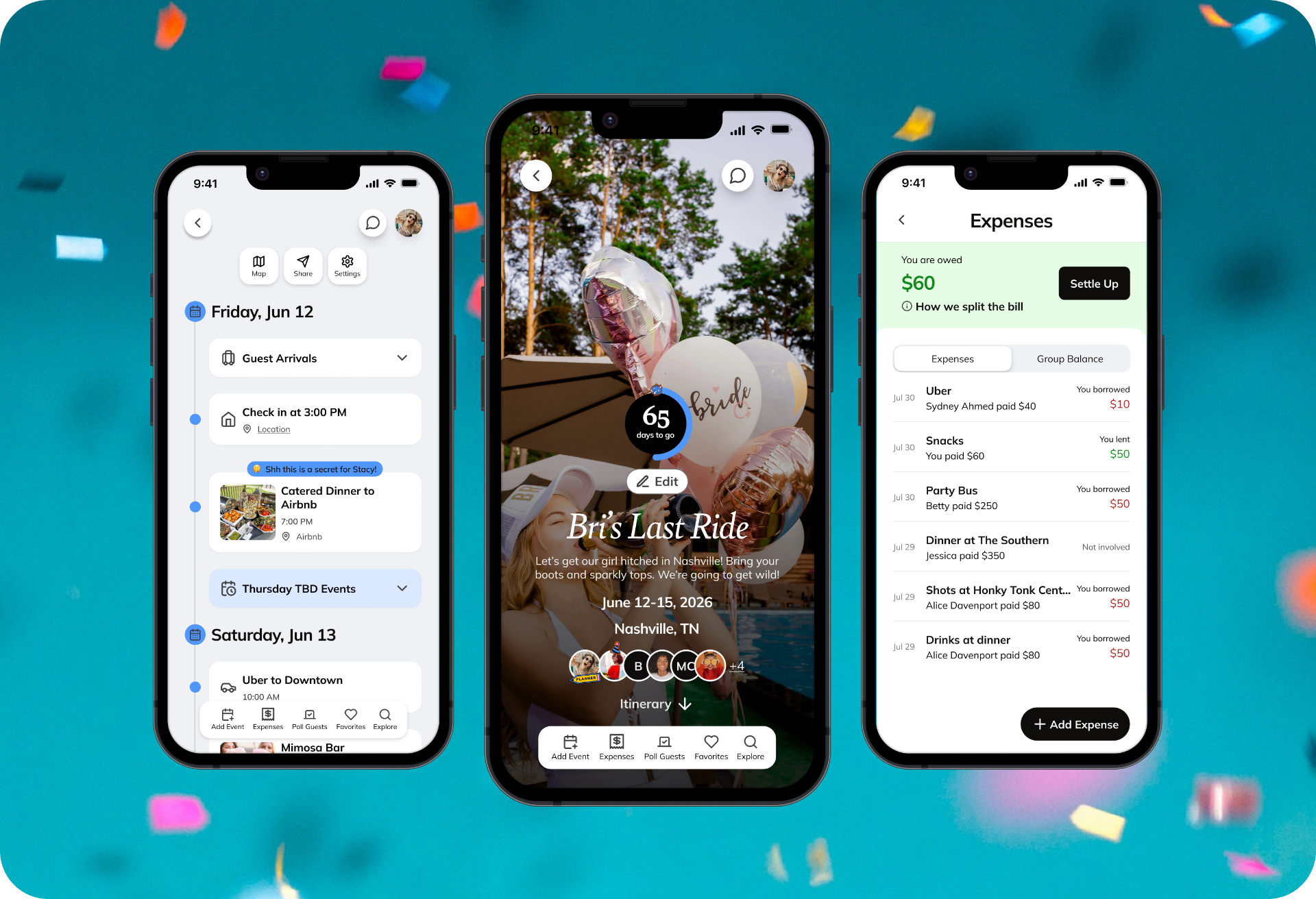
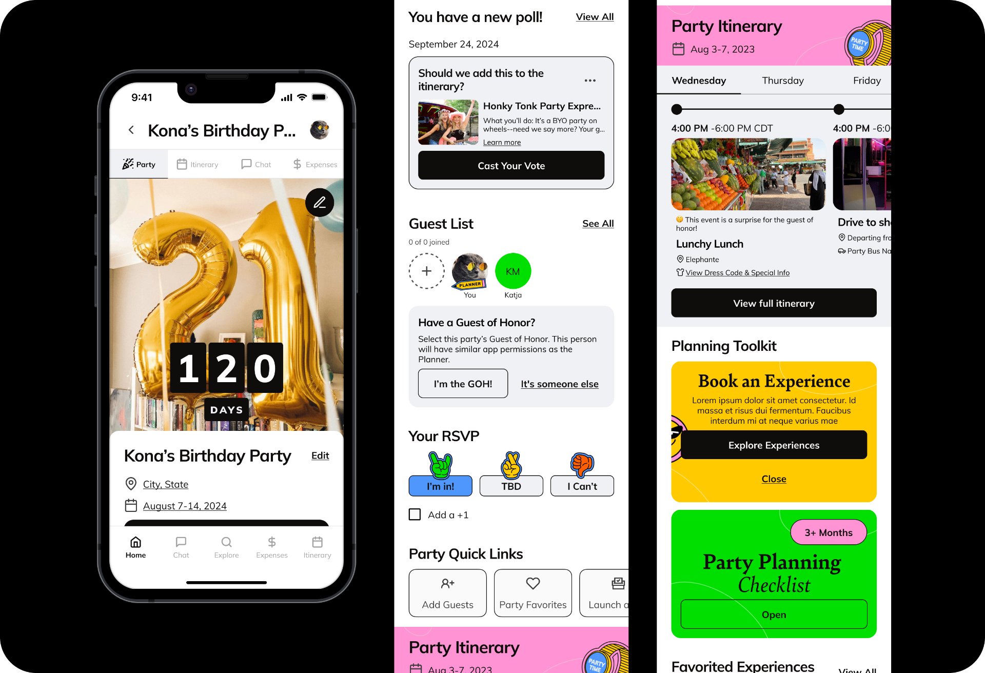
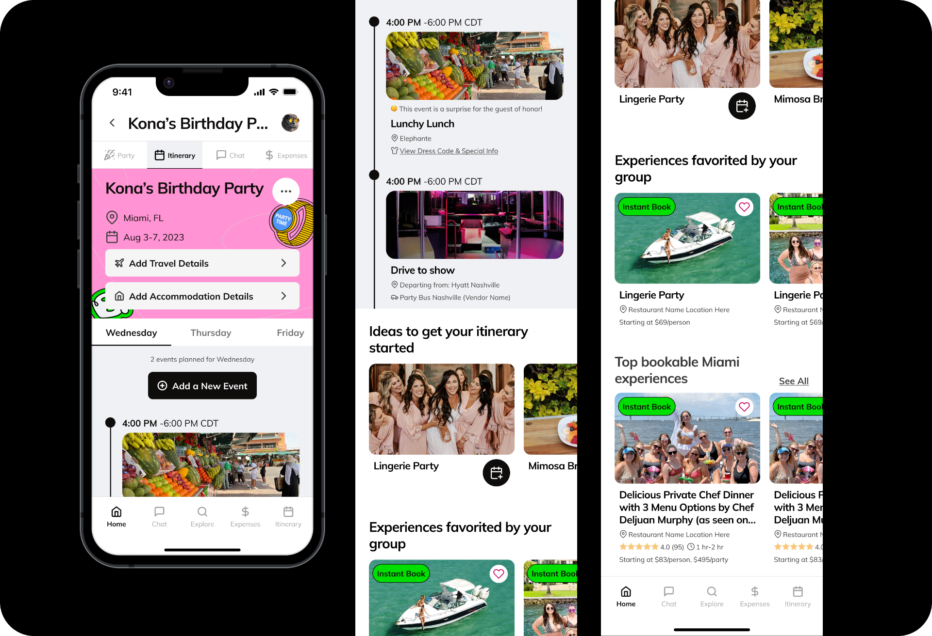
- — Redesigned party page (planner and guest views)
- — Rebuilt itinerary experience
- — New map view for itinerary
- — Redesigned expenses feature
- — New planner navigation model
Timeline
2024
Role
Senior Product Designer (solo), partnered with 2 PMs. Shipped and live.
The problem
Batch's party planner page hadn't been touched in years. As the product evolved — expanding from bachelorette parties to bachelor trips, birthdays, and group getaways — the page never kept pace. The result was a cluttered, confusing experience that left users unsure of where to start or what features were even available.
The planner experience and the guest experience were practically identical, even though planners need access to everything and guests just need to know the essentials.
On top of that, the page was full of broken links, stale content, and recommendation modules that hadn't been updated to be useful. There was no clear hierarchy, no clear next step, and no differentiation between what a planner needed versus what a guest needed to see.
Discovery & audit
I started with a thorough UI/UX audit of the existing party experience, mapping every feature and flow against actual usage data. This became the backbone for every decision that followed, helping us confidently cut what wasn't working and double down on what was.
Key analytics surfaced some striking findings:
- 15.5% guest of honor prompt usage — a meaningful subset of users engaged with GOH features, informing how we scoped and surfaced that option.
- 22.9% chat engagement — enough usage to justify keeping chat, but we wanted the decision to be intentional rather than default.
- 0.11% photo uploads to the party page — almost no one was using this feature, which opened up space to replace it with a shareable itinerary card instead.
Defining the direction
Alongside the usage data, I analyzed how planning behavior differed across city, party type, and group size — making sure the redesign could flex across all of Batch's celebration types, not just bachelorettes.
Working with both PMs, we translated the audit findings into a clear set of principles for the redesign: remove what users don't use, elevate what they do, and create a meaningfully different experience for planners versus guests.
Two ideas shaped the new architecture:
- Planner vs. guest views should be distinct. Planners get full access to features and navigation. Guests see only what's relevant to them — party details, their RSVP, and next steps. No more one-size-fits-all.
- Make the party page fit on one screen. The itinerary would live in its own dedicated tab, always accessible, freeing the main page to be focused, fast, and scroll-free.
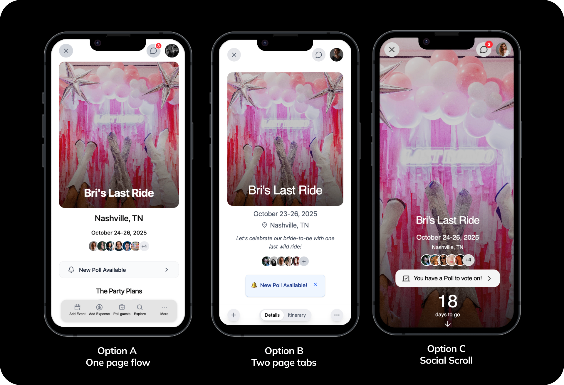
User testing three layouts
Once initial directions were sketched out, I built three interactive prototypes representing meaningfully different approaches to the party page layout. These were tested with users who match Batch's planning demographic.
- Option A — One-page flow: hero section and itinerary all on a single scrollable page.
- Option B — Two-page split: main party information on page one, itinerary on page two.
- Option C (winner) — Social scroll: large hero photo, party info, and smooth scroll into the itinerary.
Key design decisions
Option C resonated most strongly with users and stakeholders alike. It felt familiar, exciting, and made the party feel like an event worth looking at. It also gave us the visual hierarchy to surface the most important information first.
- A new navigation model for planners. After many iterations, I landed on a sticky floating menu bar anchored to the bottom of the screen for planners, keeping all key features within thumb's reach. Guests get contextual links within the page without a persistent nav — the difference signals intent: planners are in control, guests are along for the ride.
- Rebuilt itinerary experience. The itinerary was Batch's most loved feature but also one of its most visually overwhelming. The redesign simplified event creation and management, made travel details and accommodations scannable at a glance, and added a brand new map view so guests could see the full picture of their trip geographically.
- Expenses redesign based on user feedback. I reworked the flow to make it faster to log a new expense, clearer to see who owes what, and easier to settle up — all without leaving the party page context.
Results
The new design was A/B tested against the original over 2 weeks, measured across feature engagement, itinerary events added, guests invited, and overall engagement after party creation. Nearly every engagement metric saw meaningful lift:
- Creating an itinerary event: 64% increase
- Uploading a custom party picture: 120% increase
- Interacting with a poll: 67% increase
- Adding party dates: 125% increase
- Inviting guests: 8% increase