The brief
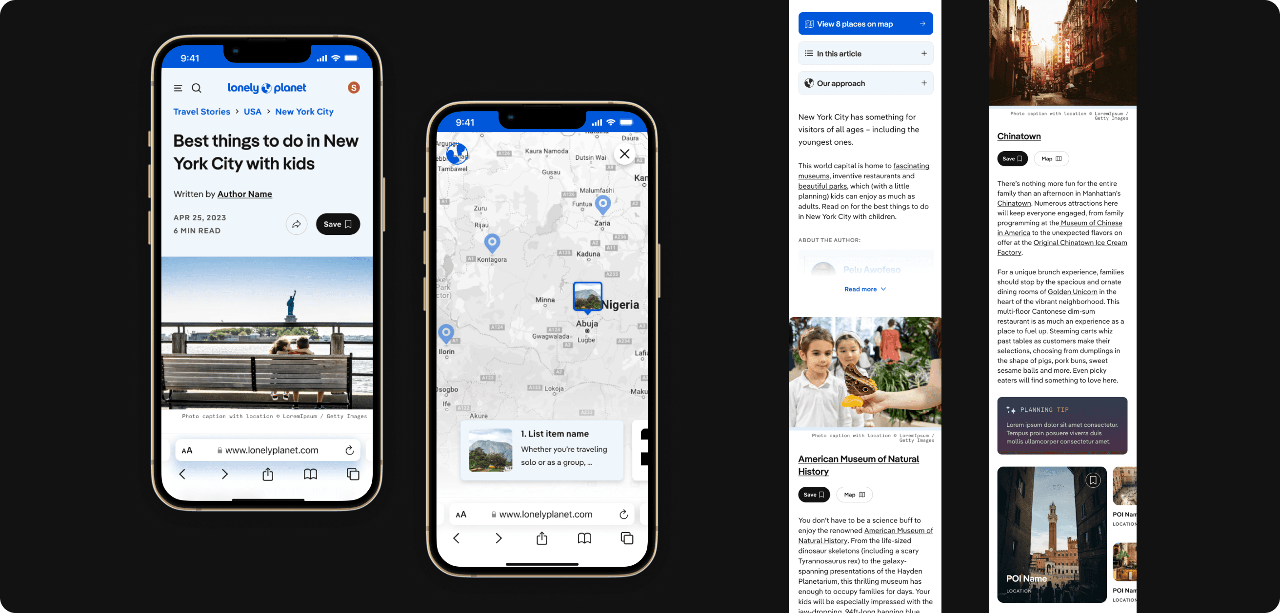
Lonely Planet's points of interest are pages dedicated to specific attractions, restaurants, parks, and other spots travelers visit. These pages will play a large part in future product goals as the company builds more planning tools and features for travelers. The current template hadn't been updated in some time and used a long-form format that didn't encourage continued reading.
The goal
Create a more valuable, user-friendly experience with new content formats that encourage interaction with page elements and continued exploration. These pages will be the foundation for the itinerary-building tool and should let users save and organize attractions into their trips.
Deliverables
- — Page template
- — Data visualization
- — MVP design + future-phase iterations
Timeline
Dec 2022 – Mar 2023
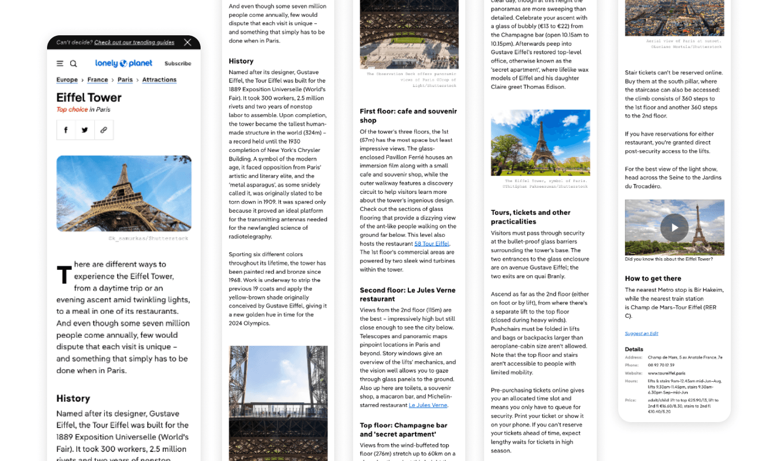
The previous template
Brainstorming, research & competitive analysis
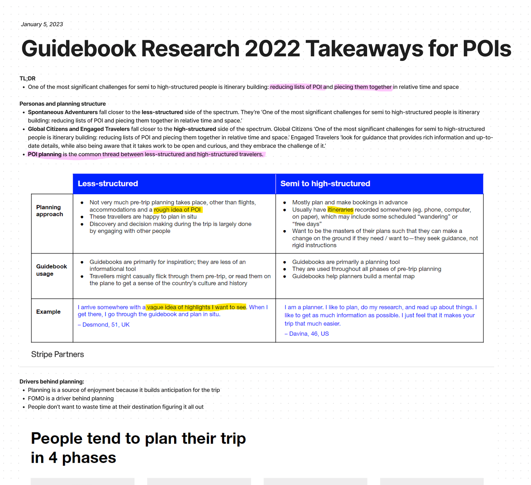
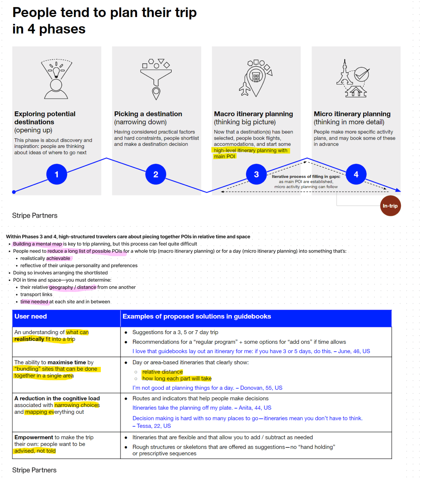
At the start of the project, a small team — myself as lead designer, the Director of Design, a project manager, and an editor — came together to define what success looks like for these pages from each team's point of view. We analyzed existing research from the Lonely Planet printed guidebooks, which feature itineraries built around points of interest. This helped us define the characteristics readers look for when deciding whether an attraction is worth adding to their itinerary.
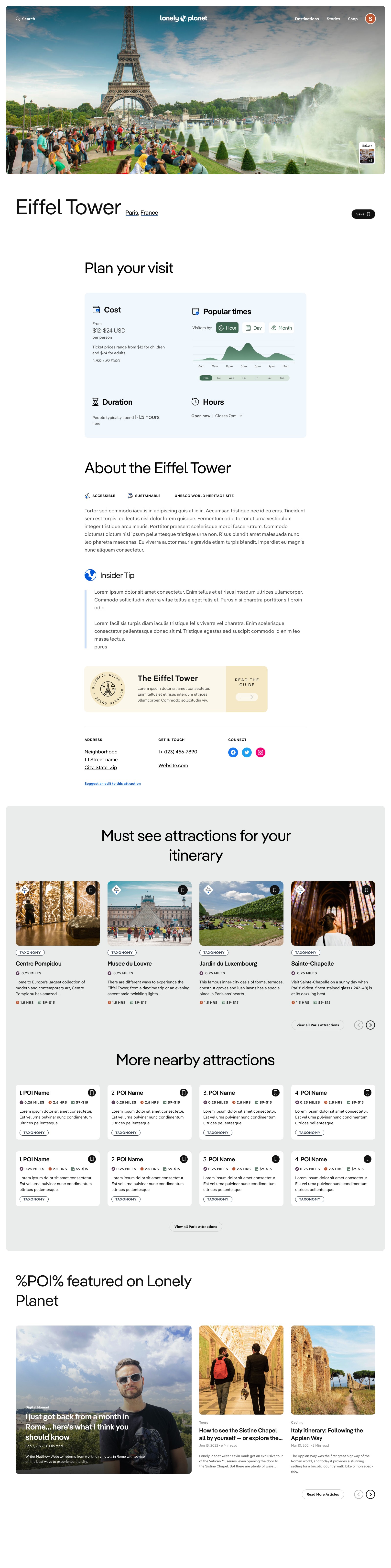
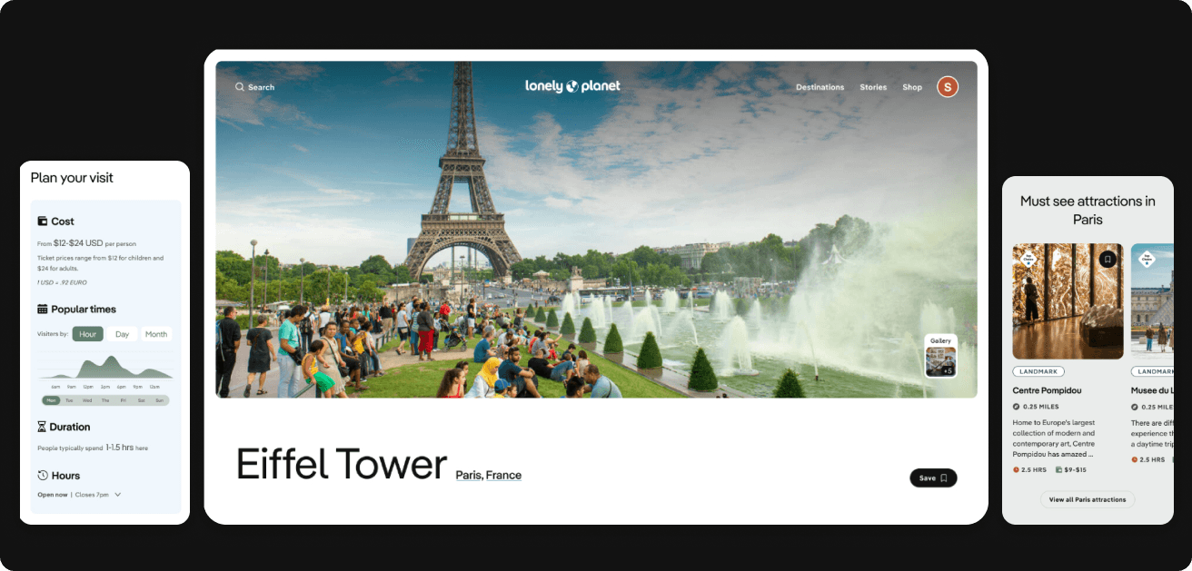
We learned travelers often try to bundle attractions together in a day, so knowing how close a place is to other nearby attractions is helpful. They also find it useful to know how long visitors typically spend at each location.
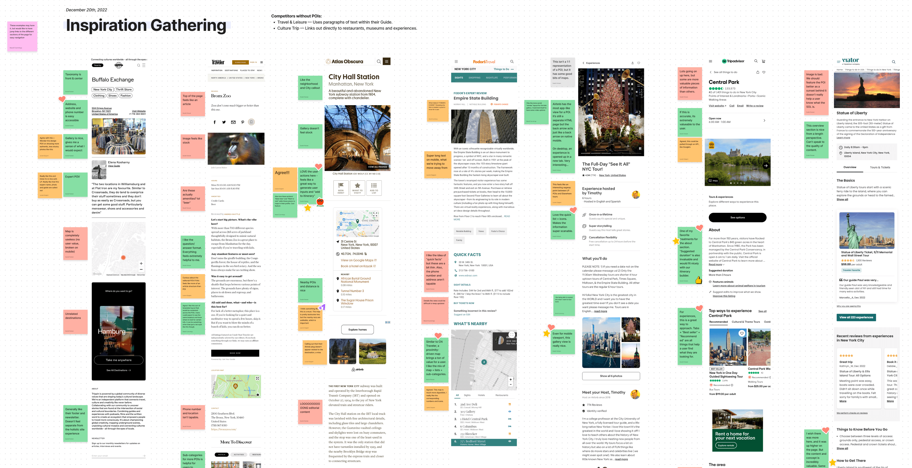
We also conducted a competitive analysis on similar brands with attraction-based content — what information they include, how they handle imagery, and how deep they go on each place. This helped us understand what travelers expect when researching attractions.
Data & content approach
The previous Points of Interest pages required editors to manually update information for every place. With over 70,000 pages, it's easy to see why hours, ticket prices, and transportation info often went stale. The COVID-19 pandemic compounded this with rapidly changing operations and closures. Bringing in critical, consistently updated information became a top priority — a substantial effort to find and integrate the right APIs.
Beyond basic attraction info, we wanted a section delivering other points of interest based on similarity to what users were viewing or by proximity — letting users continue trip planning through recommendations.
Wireframing
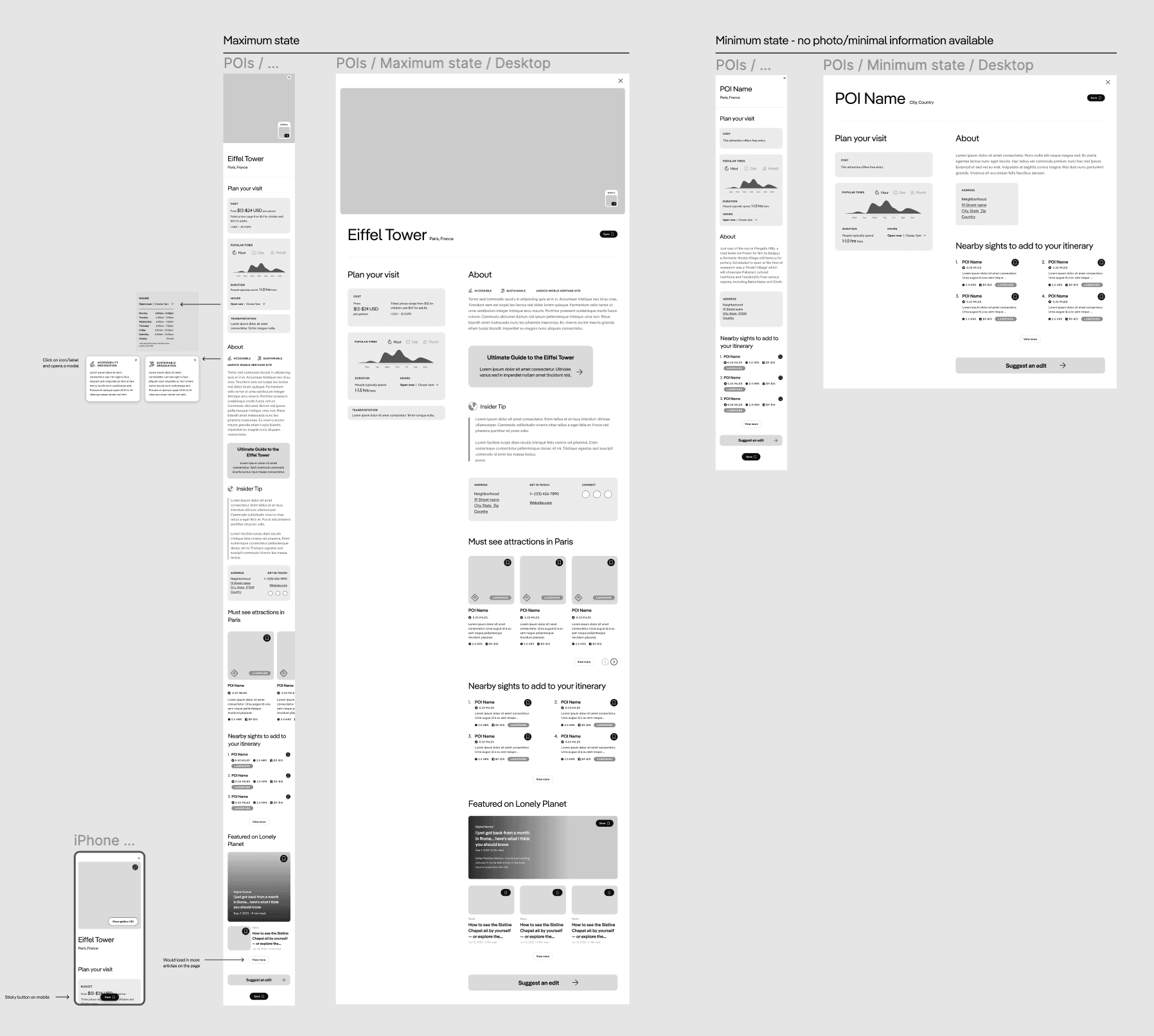
I designed the page one section at a time. Because each section required learning about available data and discovering new information we could include, it was easiest to discuss things in pieces. I worked on data visualization including graphs that show best times to visit based on popular times — graphs were new to the site, so this required defining a style for our design system. It's now used on other pages across the site.
In this stage I defined the page layout, required sections, and the minimum / maximum states for information on each page.
Solution
I took a modular design approach so information could be easily scanned, added, removed if unavailable, or rearranged on the page. This lets us test different placements and engagement rates. Within these modules, user interactions let readers explore more about a place and find others to add to their trip. This new template sets the groundwork for booking and reservation options and serves both pre-trip planners and travelers already on the ground.